12.1 Measures of Central Tendencies
12.1.1 Pie Charts
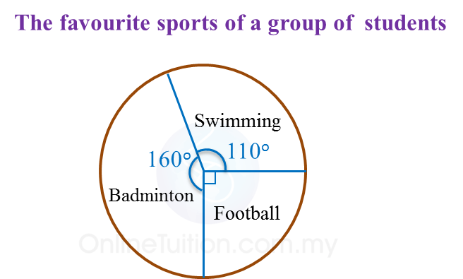
1. A pie chart is a graphic representation of data using sectors of a circle. The size of each sector shows the percentage of each category of data it represents.
Example:


2. The percentage of data represented by each sector can be calculated by using the formula below.
3. To construct a pie chart, the angle of each sector can be calculated by using the formulae below.
4. Data can also be represented by pictograms, bar charts and line graphs.
5. The choice of any these representations depends very much on the suitability of the data and the aim we wish to achieve in representing the data.